

A new visual identity for the 10th anniversary of Panierdachat
After more than 10 years of loyalty, our brightly colored shopping cart has gone away to make room for a new, more modern visual identity that reflects the current values of Panierdachat.
Don’t have your online store yet? Start your own online store now!
![]()
Why this new visual identity?
Created in 2009, during the first version of Panierdachat, the bright blue, green, and pink shopping cart has had its time. And in 10 years, the platform has evolved significantly to bring you today a professional solution optimized for all businesses.
This new logo also represents the image of the future version of the platform, which will bring many evolutions to all merchants, available in 2020.
What does the new logo mean?
With a cleaner and more abstract look, this new logo calls on the imagination by representing:
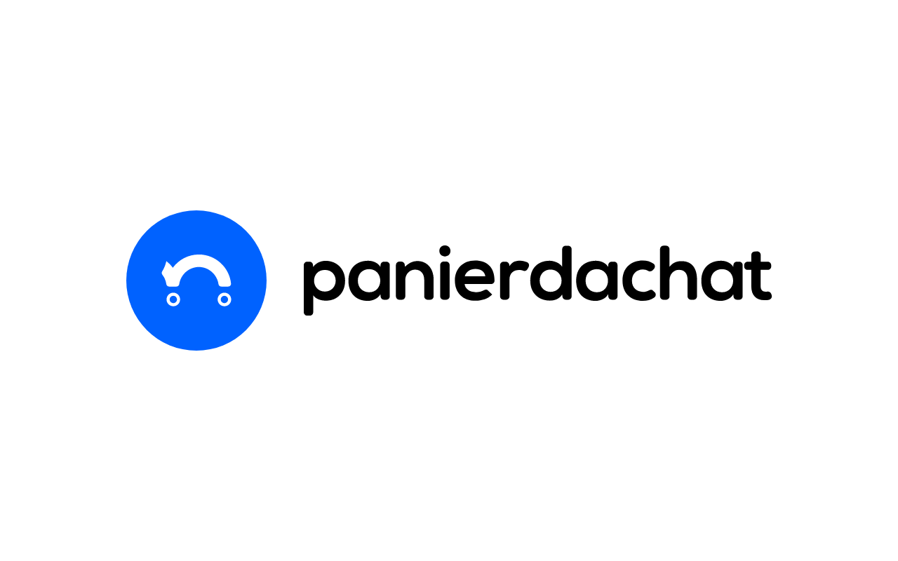
A shopping cart
The rounded line represents the “body” of the cart, the preponderance on the left represents the handle, and the two circles represent the wheels of the cart seen from the side.
This shopping cart allows you to understand at a glance the main service of our platform: online sales.
A friendly smile
Turn the logo around, and you will find a smiling face.
Reminiscent of the emojis in your messaging, this smile represents the friendliness of our customer service and marketing experts who are always attentive to our e-merchants.
A smile that we want to keep on your faces by allowing you to flourish in your adventure in e-commerce and online sales.
Softer and lowercase letters
For easier reading of the platform’s name, the name “Panierdachat” has changed from “uppercase” to “lowercase.”
With a softer font, the name is more pleasant to read and reflects a more modern and friendly image than the previous logo.
The font used is:
A dynamic image
The cart handle is the extension of a series of rebounds to evoke the dynamism of Panierdachat stores, but also an intuitive step-by-step handling to be accessible to everyone.

Why blue?
We chose blue for all the symbolism it brings.

In the language of colors, blue means calm, serenity, and loyalty. Values that we bring to our thousands of merchants every day with a secure professional platform that allows them to focus on their sales and customers.
Blue reminds us of elements of our environment like the sky and water, elements that we all know. A simplicity and ease of access that we want to offer you on the platform.
Blue is one of the 3 primary colors, it is the basis for many color blends and shades.
This perfectly represents Panierdachat’s goal: to offer you a user-friendly platform that allows you to create all the shades of sites you want to sell your products and services online.
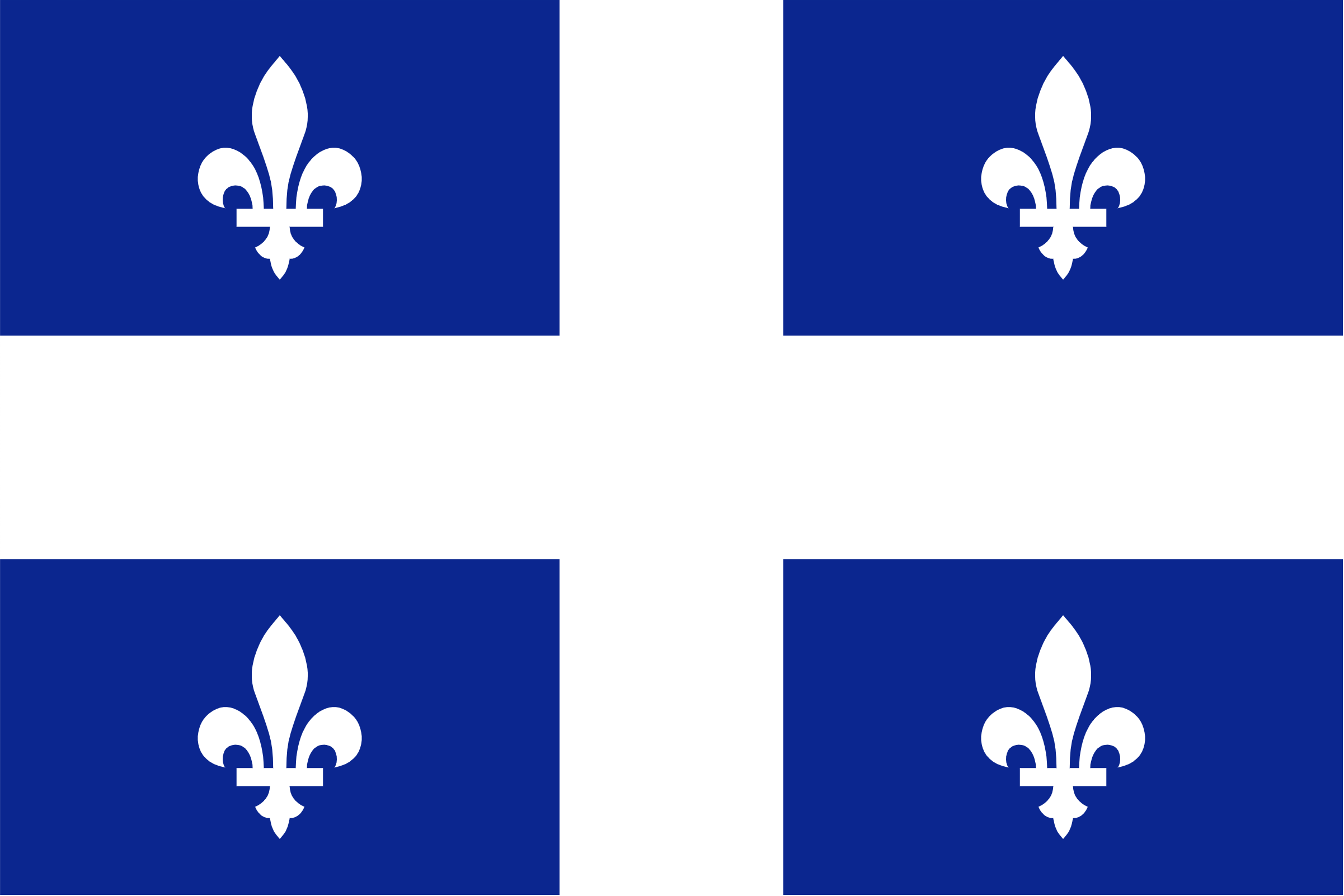 Blue is also the predominant color of the flag of Quebec, the region where Panierdachat proudly comes from.
Moreover, blue is the most loved color in the world. Because Panierdachat wants to address everyone, from the youngest to the oldest.
So, what do you think of our new visual identity?
Tell us by email or on our social media: Instagram.


Micheal Villeneuve is the President and founder of Laradev. Laradev is certified in Laravel development, specializes in universal application, and offers training and support.